Susmagpro.
New visual identity and platform for an EU Horizon 2020 research project on rare-earth magnet recycling.
Funded by the European Union's Horizon 2020 program


The platform
See it in action.


The challenge
Client's needs.
Centralized project hub
A website that gathers all data about the sustainable recovery, reprocessing, and reuse of rare-earth magnets in one easy-to-explore place.
Clear partner overview
A clear and understandable preview of all the European companies involved in SUSMAGPRO, with their roles in the project visible at a glance.
Strong, recognizable brand
A complete visual identity for SUSMAGPRO that communicates the project's mission and works across web, print, and physical materials.
What we built
Solutions.
Visual Identity
Created a complete new visual identity for SUSMAGPRO - including a special color palette that reflects the project's focus on sustainability and circular economy principles.
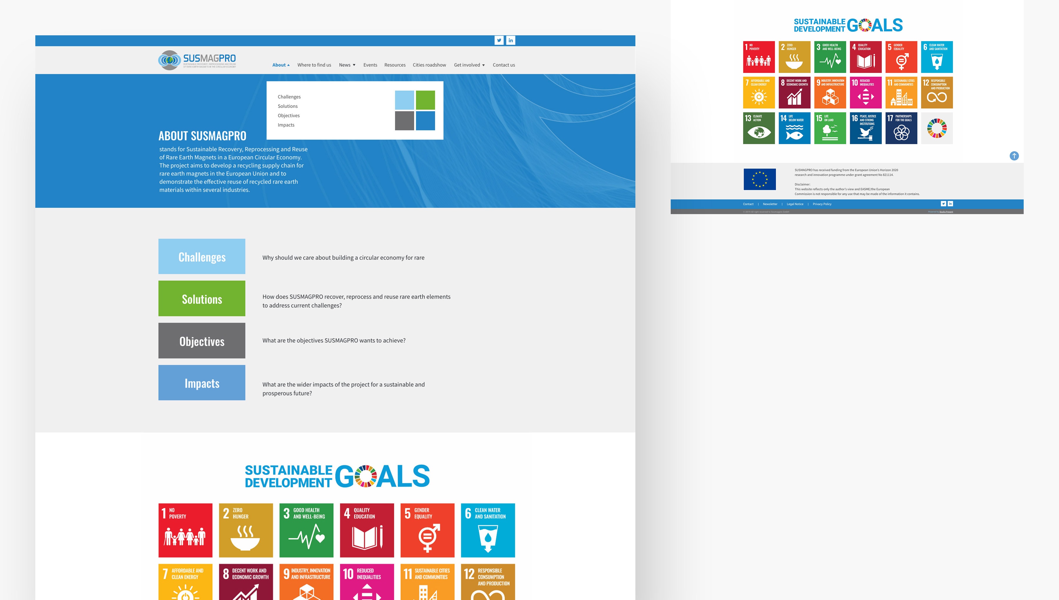
Research Platform
Built a clean, simple website designed for a research audience - easy to navigate, clearly structured, and accessible to visitors from across the EU scientific community.
Interactive Map
Developed an interactive map displaying all companies and organizations working within the SUSMAGPRO network, showing their location and specific role in the project.
Branding
Designed a full suite of branding materials including flyers, posters, roll-ups, and other print materials - ensuring a consistent visual identity across all channels.
Visual Identity
Created a complete new visual identity for SUSMAGPRO - including a special color palette that reflects the project's focus on sustainability and circular economy principles.
Research Platform
Built a clean, simple website designed for a research audience - easy to navigate, clearly structured, and accessible to visitors from across the EU scientific community.
Interactive Map
Developed an interactive map displaying all companies and organizations working within the SUSMAGPRO network, showing their location and specific role in the project.
Branding
Designed a full suite of branding materials including flyers, posters, roll-ups, and other print materials - ensuring a consistent visual identity across all channels.
European science, made visible.
SUSMAGPRO is working on one of the most important materials challenges in the circular economy. The platform was built to give that work the visibility and credibility it deserves.
THE RESULT
European research .
A clear, well-branded platform that gives an EU-funded research project the professional digital presence it needs to connect partners and communicate its mission.