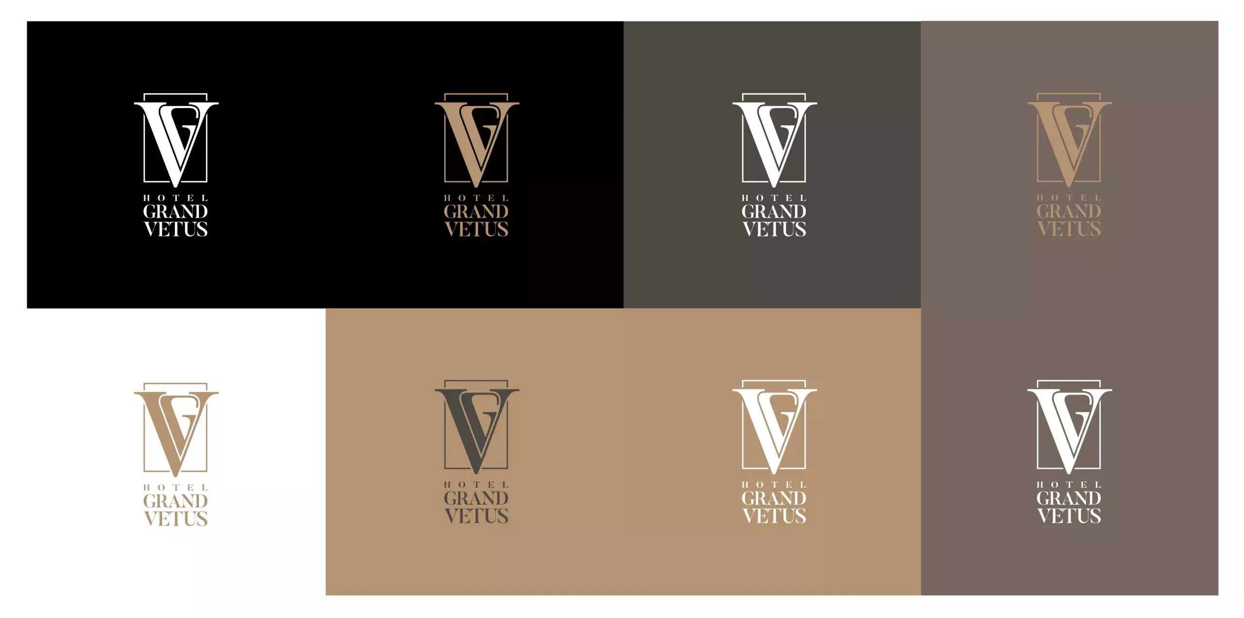
The logo is represented by the initials of the hotel's name and can stand alone or with a typeface that is positioned below or next to it. In this way, the logotype can be easily adapted for different purposes.
In addition to having different layouts, the logo in certain colours can be placed on predefined backgrounds so it can always leave an impression of elegance and luxury.
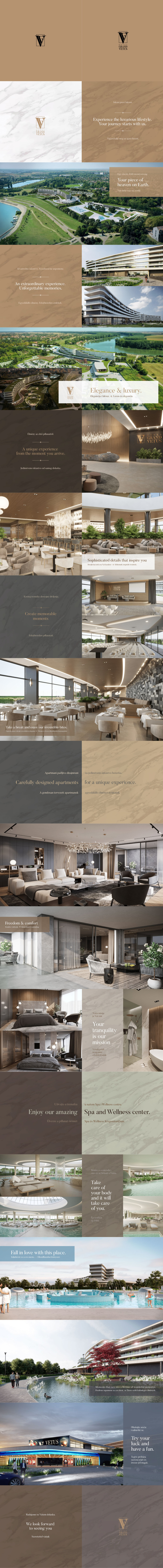
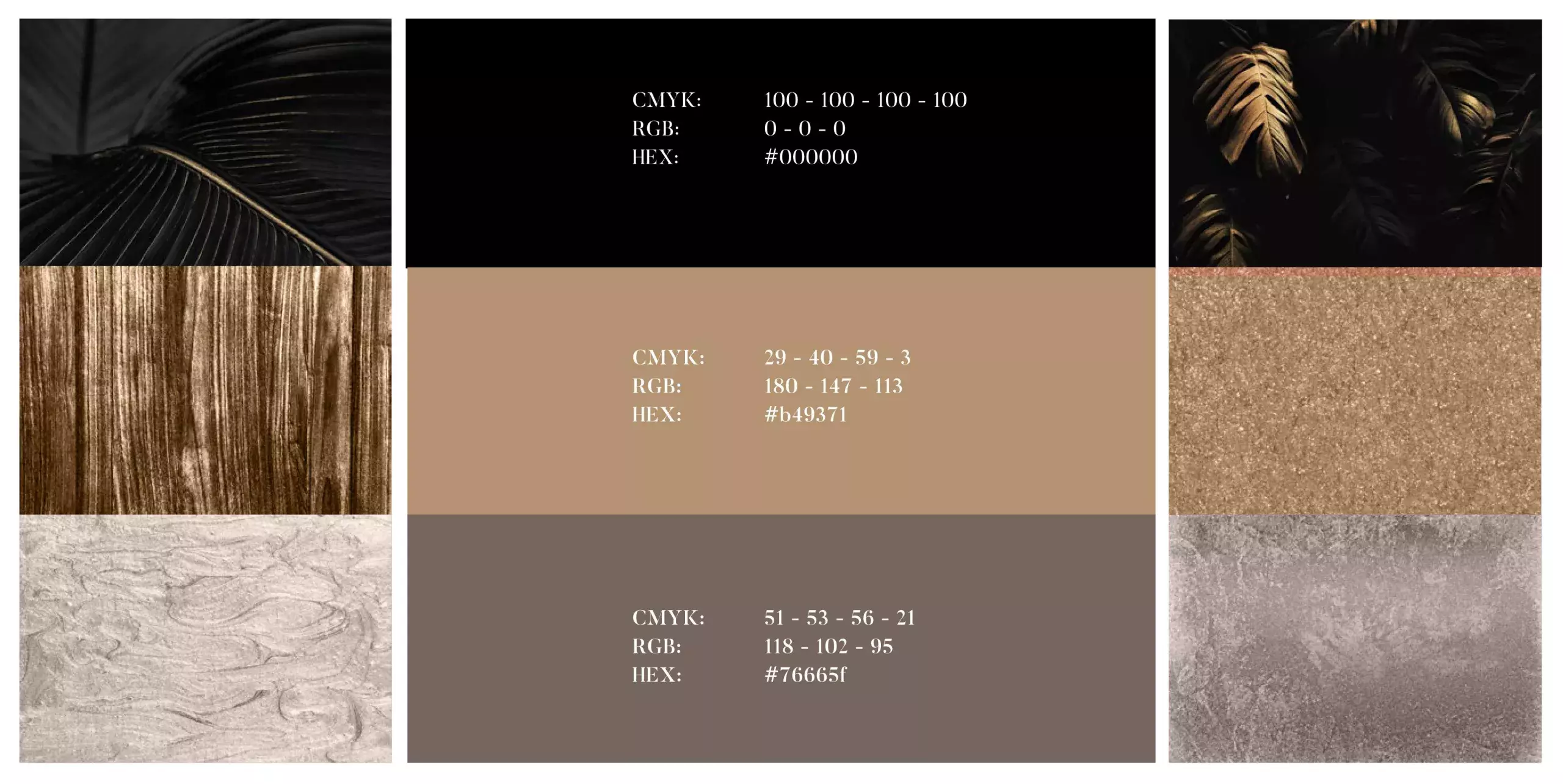
The colours used in creating the visual identity have the task of enabling the brand to communicate elegance, luxury and comfort but also seriousness.
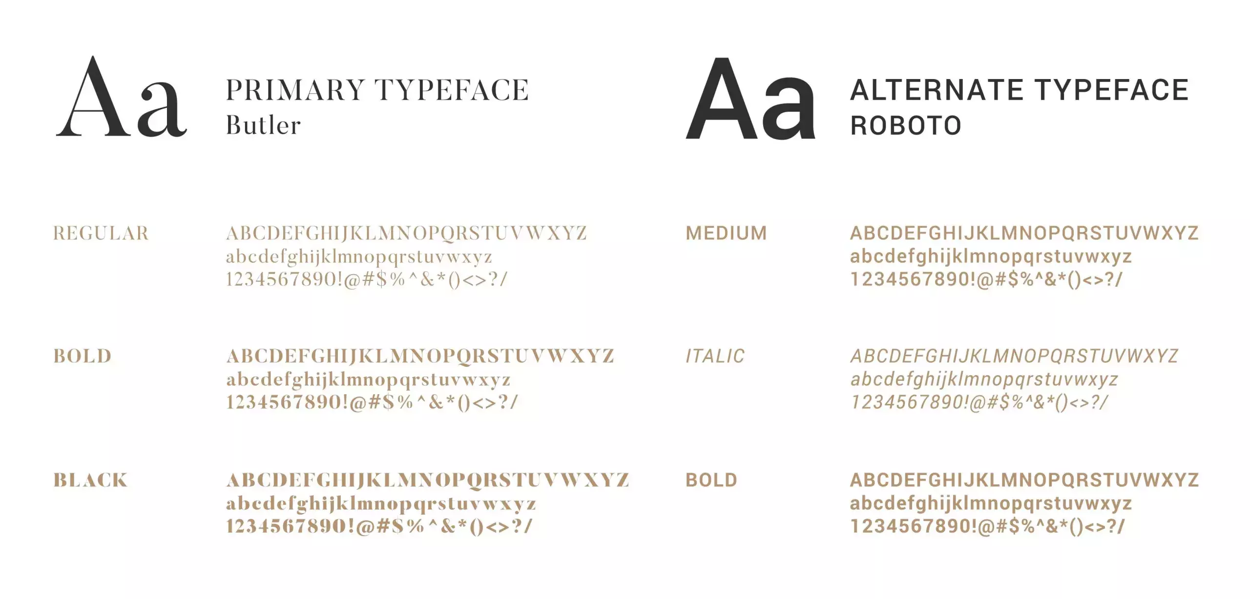
When we want to convey the luxury note of Grand Vetus hotel through headlines and slogans, we use stylish Butler font. On the other hand, Roboto is easier to read when it comes to longer texts in promotional materials and on the website.
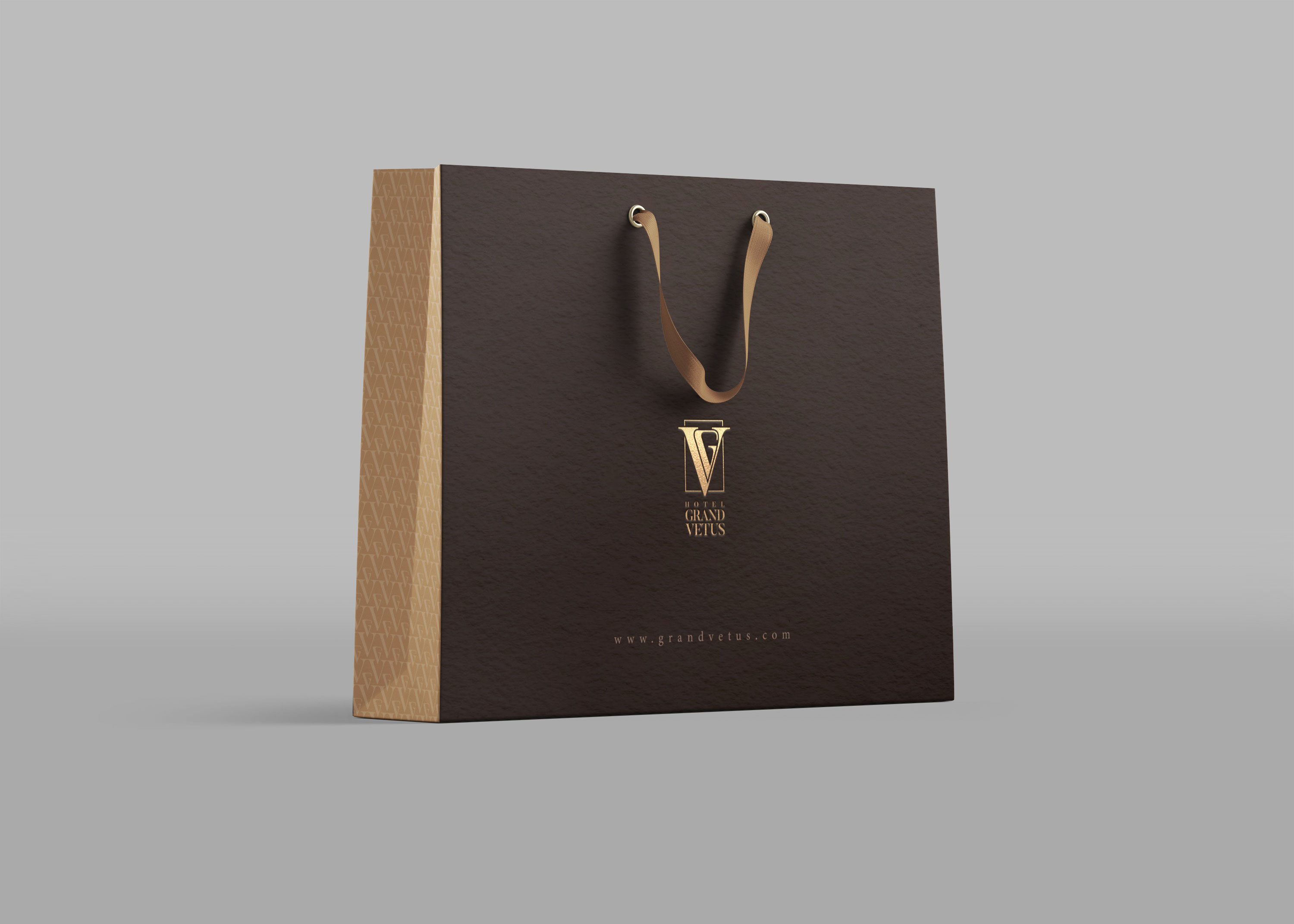
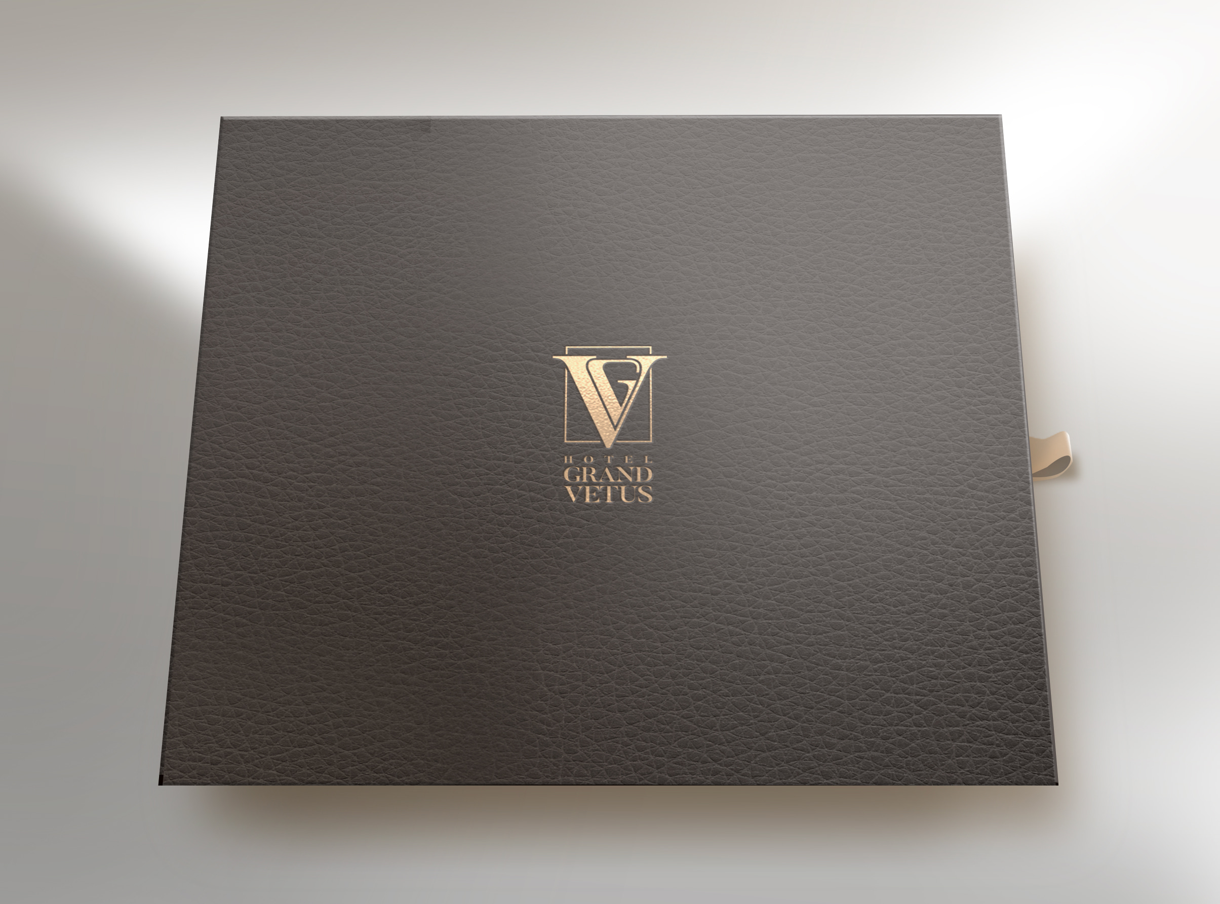
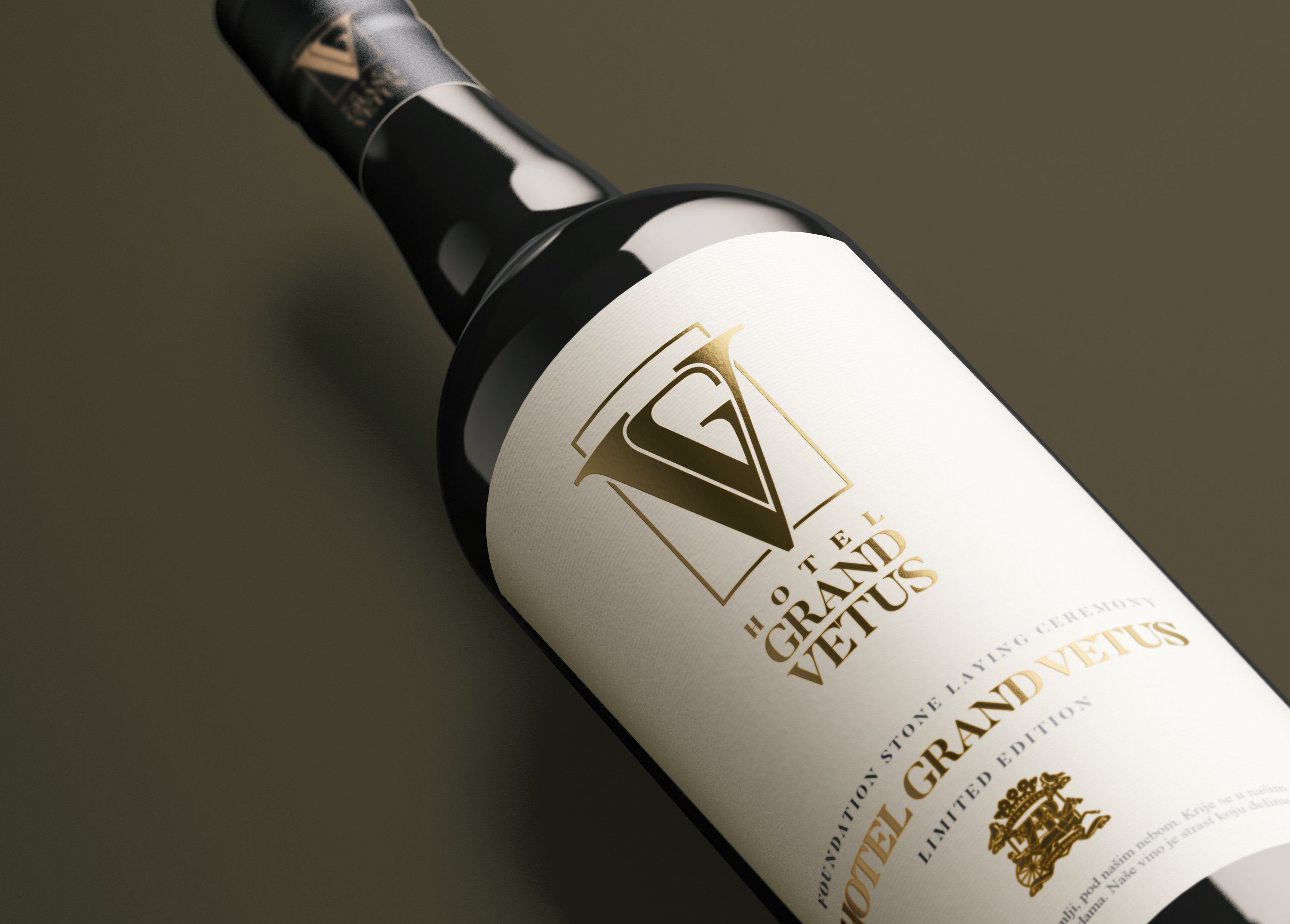
When presenting the company branding to a client, we always place the logo on various surfaces so that client can be aware of its applicability and know that it will fit nicely onto its promotional products.
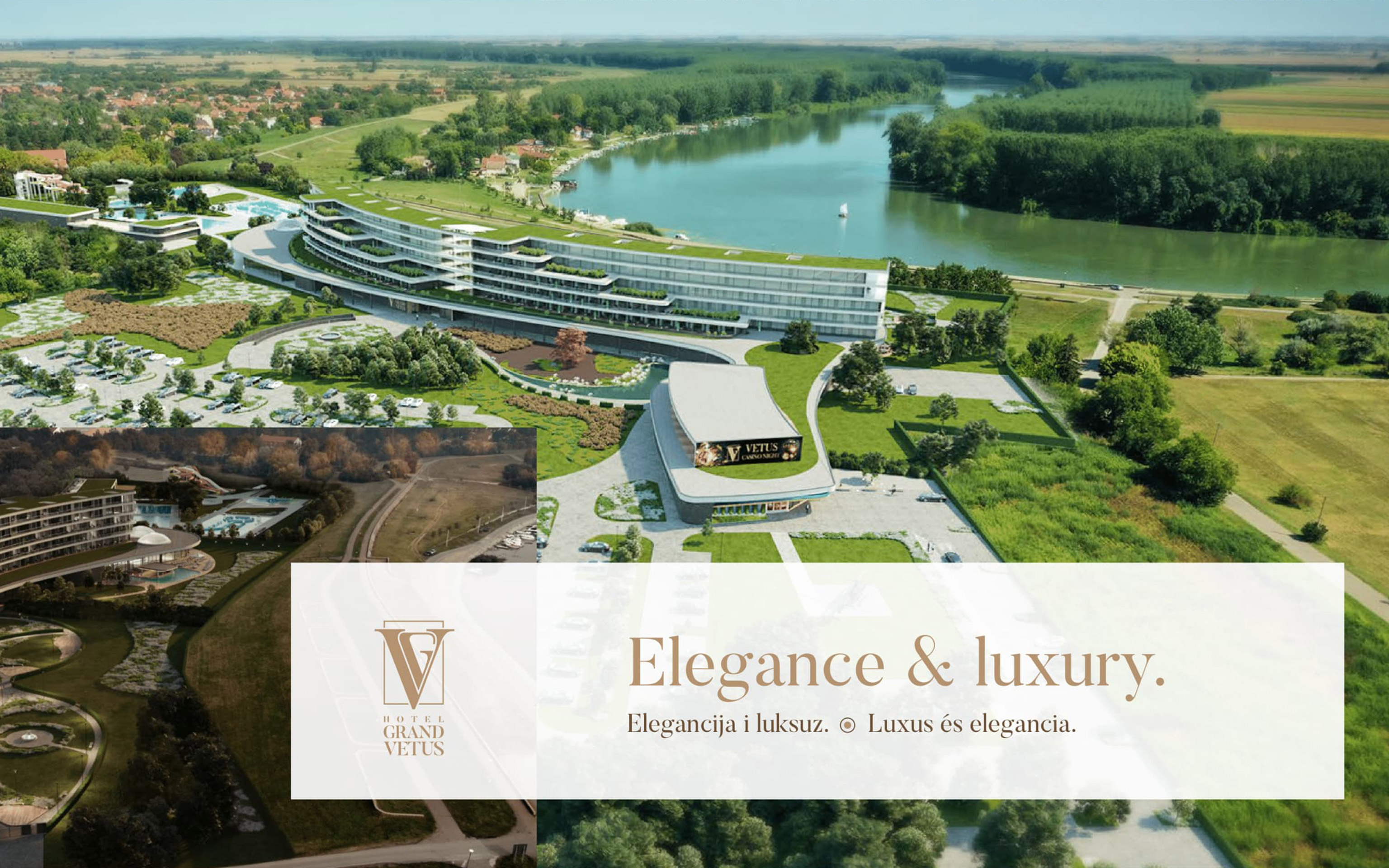
We have made a catalog to awaken the imagination of potential guests about their future experience in every aspect of the luxurious vacation in the Grand Vetus hotel - enjoying the riverside and nature, admiring the details, indulging in good food, feeling the apartment comfort, leaving the body and the mind to rest, trying their gambling luck.