In 2019, we decided to redefine the Studio Present brand for its tenth anniversary. The main goal of this refinement was to better understand the company's core values and its culture which are strongly needed as the company continues to grow in various aspects.
As it is with your own children - you love seeing them turn ten, and you feel proud - but you still have to set boundaries so things don’t get out of control when you have a steady growth

We base our main brand value around one thing - meaningful relationships. These can manifest through different perspectives - the most important being that you can always take part in something that empowers you and your colleagues to be one step closer to a common goal - or maybe even your own.
Here at Studio Present, we are all different - but that’s our strength because we grow together by supporting each other.
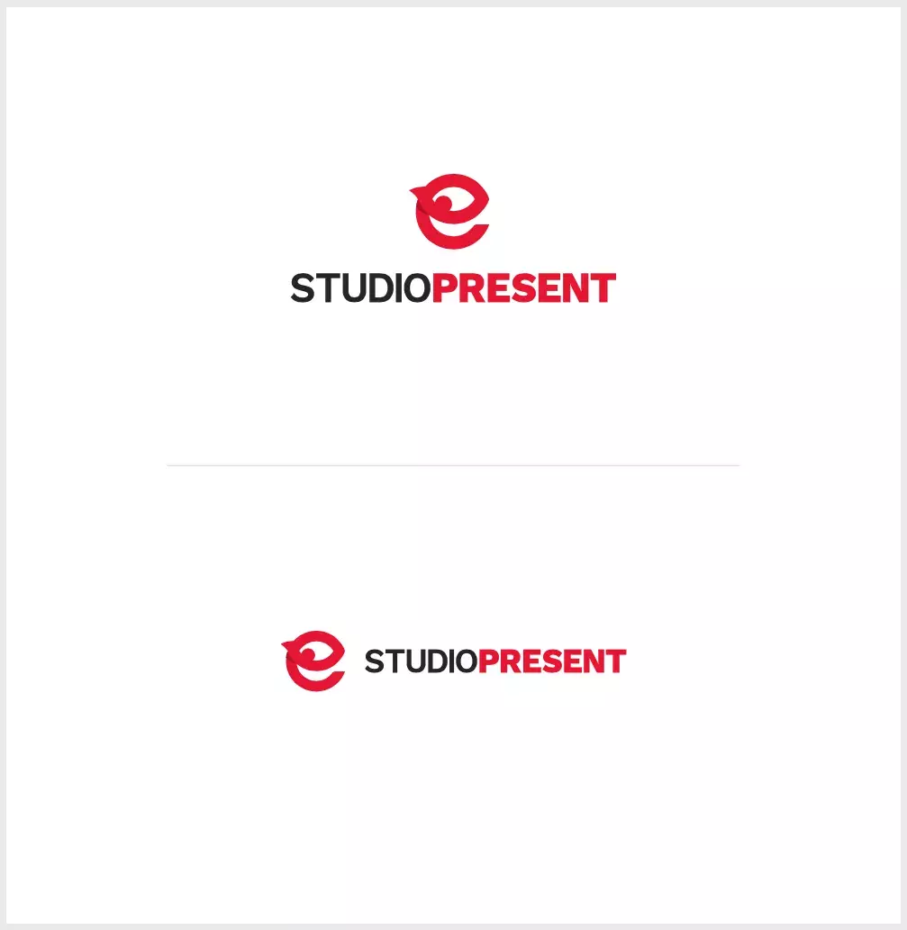
A few years back, we refined the original Studio Present logo, but people were still unsure how you are supposed to use it in various digital and print works. We have that adorable monster-like “e” icon - but should it go next to the typography? Before it? Under it? This time, we achieved a strict, yet understandable style guide that defines the usage of our icon, typefaces, colors, and other core graphic elements.
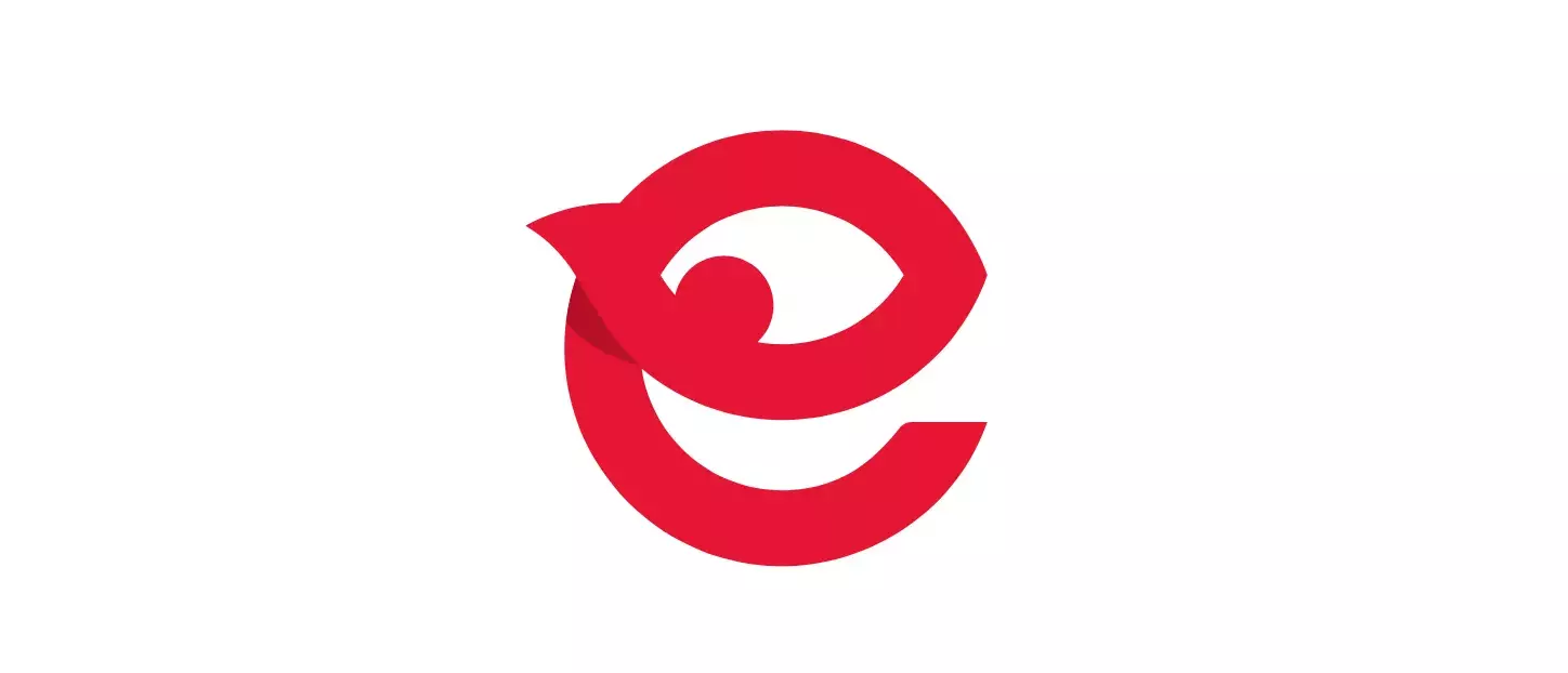
The “e” Icon
We were always proud to embrace the “e” icon - and we still are. The “e” monster is our mascot and now a well-known symbol of our digital agency.
When used in the logo, the name of our company is written without any spaces, in ALL CAPS with “Present” having a bigger weight than “Studio”. When written in a text (blog, chat, etc.), Capitalize Case should be used, with a space between the words (Studio Present). If you want to shorten the name in conversations, use “SP” - but, please, do it only if you’re lazy.
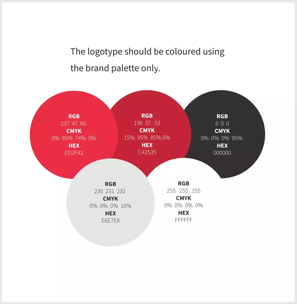
There are millions of colors around us, but we have always tried to stick to a modern color scheme that includes, but is not limited to bedrock black, radiant red and white. Pantone red: 1788 C.
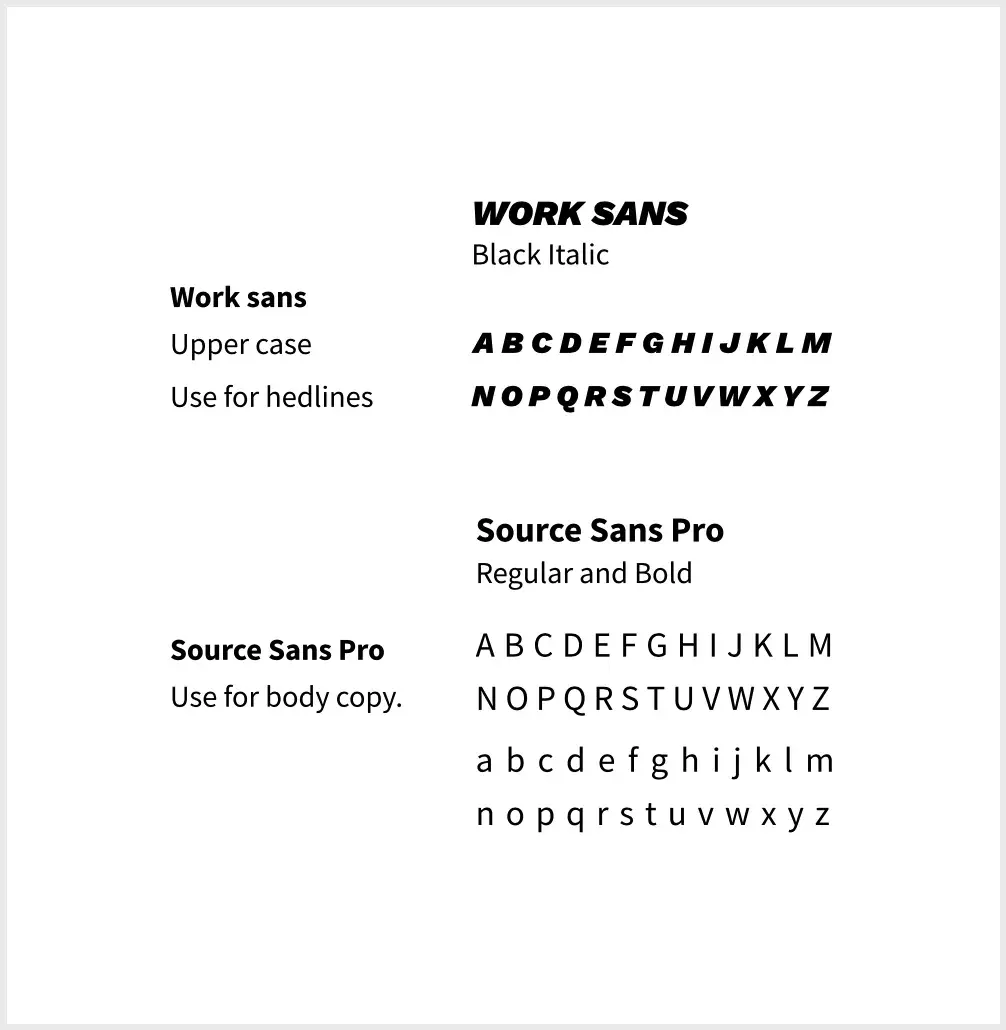
Here at Studio Present, we believe in an open-source world. Being part of it is one of the things that makes us proud. As an homage, our corporate typography consists mainly out of open-sourced and creative commons fonts.
In addition to a very strong and present heading typography, it is preferable to use one of the symbols which help better understand and convey an emotion behind a certain message which is being shown on print or digital - eg. social media post.
The symbols that can be used are ones we can find in our everyday working environment, related to development and design - which we love and adore.
Because of that, you will usually find symbols like underscores, dashes, asterisks, curly braces, hashtags, pluses, and quote signs next to (or before) our wordmarks and all around our office. These symbols are often used based on the context - eg. underscore is used when content is about development, plus when talking about people (everyone is a plus here!), asterisks when there is a special announcement and so on and so forth.
Multiple people are responsible for our look and feel on various platforms - so we have to make sure that, besides looking, we sound the same. Our voice is consistent, but our tone changes depending on the message that we want to portray. Our messages are calm and witty - with a sense of humor that makes you feel warm. You can see the examples applied to our merchandise below which we have designed since we started with the project of rebranding.
Here's also our Brand Book where you'll find more details about how to use logos on different solid or photo backgrounds and, most importantly, how not to use the logo. Download it here.


